DISH Web Simplification
Role:
Lead UX Designer
Context:
Dish TV separates their acquisition and engagement / retention platforms. New customers sign up on dish.com and are then directed to my.dish.com to manage their account and contact support. These two web experiences are inconsistent, with separate UI styles and tone of voice. These conflicting approaches frequently cause confusion for onboarding and for account management. Given that Dish TV has a primary demographic of customers over the age of 65, these differences can also lead to initial distrust of one or both platforms.
This project was the start of normalizing the design library, standardizing the UX/UI arsenal, and realizing significant cost and operational savings across the enterprise.
OKRs:
Reduce contact volume and cost-takeout through digital self-service
Increase DISH.com conversion
Increase cross-brand purchases
Increase Dish TV upsell take-rate
Tools Used:
Figma, Figjam, Quantum Metric, UserZoom
The Team:
DISH Network teams partnered with Slalom Consulting on this project.
The Approach
Define key metrics for both dish.com and my.dish.com, based on company OKR’s and stakeholder buy-in from acquisition, retention, and CXO.
Identify key flows contributing to the selected KPI’s and isolate design opportunities within these flows.
Work with UX research, Product, and Design to create high fidelity designs and requirements with strong quantitative and qualitative data to back up our approach.
Pre-Design Research Findings
Key highlights based on existing Dish research and new research conducted.
Abandonment & Time in Cart
Existing web purchase flows have a 90% abandonment rate and the average checkout time exceeds 17 minutes.
Self-Service
While logged into “MyDish”, users were looking for clear easy access to manage their account, not marketing information.
Demographics
While 60% of the DISH audience is 65+, 40% of the audience is under 65—a potential untapped market for self service options on web.
Mobile First
The majority of customers are accessing dish.com and my.dish.com via their mobile device.
Current State
Today, the digital customer experience is spread across a number of sites, across disparate design systems, and via thousands of unique URLs. How customers make plan and hardware choices, how customers perceive their order, how they get support, and how they help themselves are all under review in this product development.
dish.com current state (fall 2023)
my.dish.com current state (fall 2023)
Validating User Needs
The team used personas to guide us in creating a more user-centric experience. Design and digital product teams mapped the current customer journey starting at product and brand recognition through purchase, support, and service changes. We identified customer pain points and opportunities for the future state.
Scope Alignment
We prioritized four user flows (homepage, entertainment shopping, checkout, account dashboard) that directly aligned with company OKR’s and addressed our customers biggest pain points. We then conducted workshops to ideate and define exactly why customer frustrations were occurring. These allowed us to build future-state solutions that both solved these issues and aligned with company goals.
Moving into Design
The product designers created design principles around value, service, and technology to guide our process. For example, avoiding dark patterns, using straightforward language, and breaking up long flows into sub-steps. We met with the global design system team and aligned on using a design system that more closely aligned with the enterprises’ other brands.
Design Process
Reviewed research and defined requirements
Sketched and wireframed
Created high-fidelity design and prototype
Tested and iterated
Homepage
Reviewed Research & Defined Requirements
Reviewed existing research, analyzed competitors and best practices, and defined requirements.
Sketched & Wireframed
Whiteboard sketched the necessary sections of the homepage, and detailed interaction patterns.
Created high-fidelity design & prototype
Explored different hero treatments, dark mode, and worked to create a feeling of watching entertainment. Created prototype for testing.
View prototype
View design rationale
Tested & Iterated
Concept and end-to-end tested the full homepage. Iterated based on SUS scores, ease, of use and overall sentiment.
Entertainment Shopping
Reviewed Research & Defined Requirements
Created requirements for new and improved ways of shopping for TV.
Sketched & Wireframed
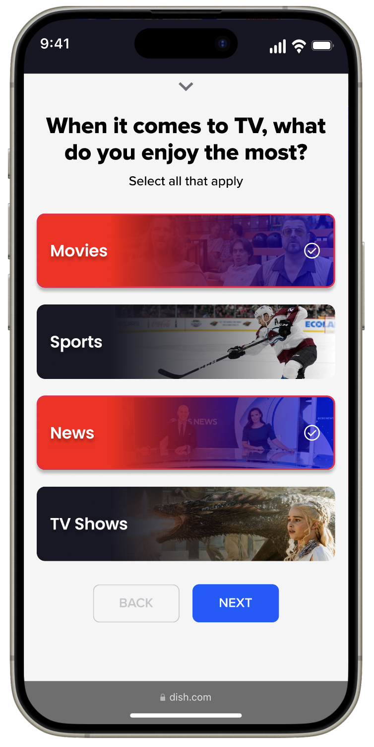
Whiteboard sketched two ways of shopping, by users selecting their preferred channels to get matched with a DISH package, or by taking an entertainment quiz to receive a DISH package recommendation.
Created high-fidelity design & prototype
Explored new visuals, dark mode, and worked to enable customers to find the right DISH package for their needs.
Tested & Iterated
Conducted usability testing to explore channel shopping interactions and quiz expectations.
Checkout
Reviewed Research & Defined Requirements
Collaborated with product managers, researchers, and developers to create requirements for the future state checkout experience.
Sketched & Wireframed
Whiteboard sketched the sub-steps of the checkout process, detailing the major actions within each sub-step.
Created high-fidelity design & prototype
Explored two different visual treatments, animations to communicate feedback, and interaction patterns to move users through the flow efficiently.
Tested & Iterated
Conducted three rounds of usability testing, exploring two different design directions, equipment results interfaces, ledger readability, and more.
Account Dashboard
Reviewed Research & Defined Requirements
Prioritized jobs-to-be-done for account management and collaborated on product requirements.
Sketched & Wireframed
Created wireframes focused on the content per card (e.g., “Billing and Payments”) on the dashboard and the sub-navigation.
Created high-fidelity design & prototype
Created three full page versions of the dashboard, and many state variations per card (e.g., “Billing and Payments”).
Tested & Iterated
Tested information hierarchy of dashboard, user sentiment and expectations for two versions (new customer and payment due).
User Testing Approach
Conducted desktop and mobile baseline tests with the current experience to further understand pain points and opportunities.
Tested the checkout and home page experiences to get targeted feedback on specific areas of the experience.
Ran users through end-to-end flow processes for shopping, purchasing, and account management with look alike and real audiences.
System Usability Scale “SUS” Deep Dive
Our mobile baseline end-to-end flow (homepage -> checkout-> account) tested below average on the system usability scale.
Our simplified mobile end-to-end flow and redesigned homepage both fell in the “excellent” range.


